Project Background
This project was completed for an Information Visualization & Aesthetics class (INFO 424) at the University of Washington. For the project, we had to create an infographic on a topic of our choice utilizing the same layout, colors, and fonts as another infographic. Since I was involved with the student organization, Huskies for Suicide Prevention & Awareness, and advocate for mental health, I thought this was a good opportunity to bring awareness to the topic of suicide in the United States.
The Process
Choosing Our Models
The first step was to choose our infographic models. For this project, we needed to have a base model (to emulate the layout and visual style/language), a typography modal, and a color model.
Base & Typography Model
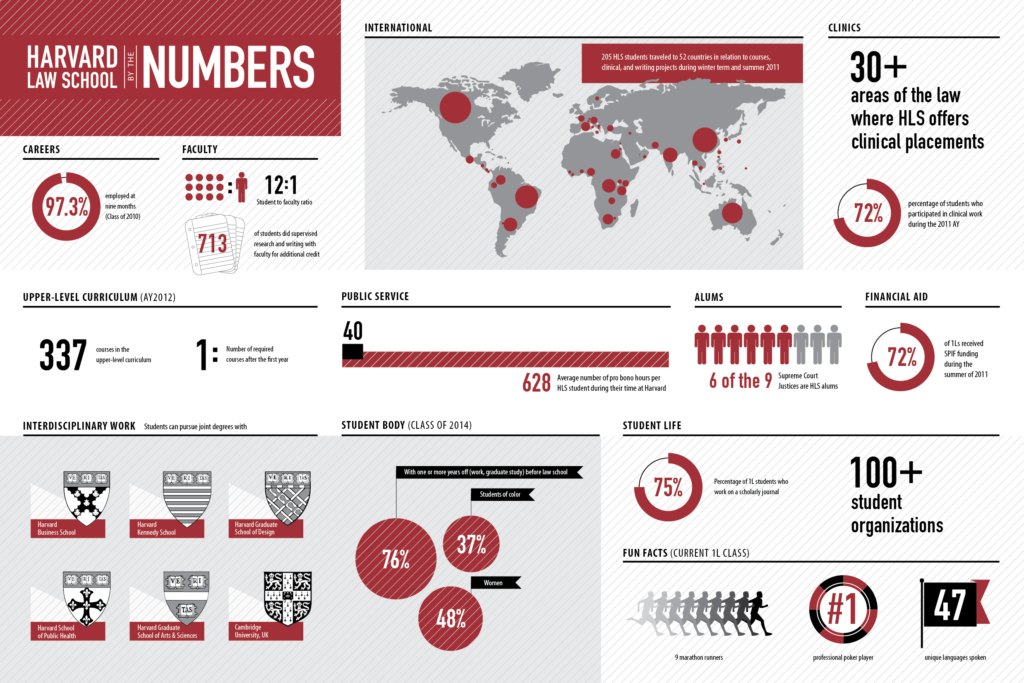
I chose this Harvard Law School infographic for my base and typography models because it’s informative and easy to read.
Color Model
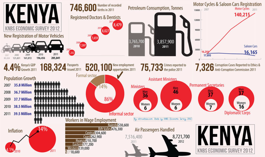
I chose this Kenya infographic for my color model because it utilized red, black, gray, and brown. These colors give the infographic an important and serious tone.
Creating the Pieces
Now that we had chosen our models, we had to create five different types of displays to go on our infographic: A numbers display, an appearance display, a location display, a time display, and a relationship display.
Numbers Display
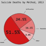
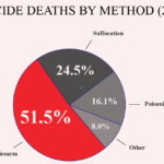
For our numbers display, we had to select a data set related to our topic and create a display that effectively conveyed a message. In my first iteration, I started with a simple pie chart. With my next iteration, I added percentages and labels inside each section, making it easier for the viewer to understand the data. I also changed the colors of the pie chart due to the fact I changed my color model.

Appearance Display
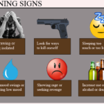
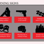
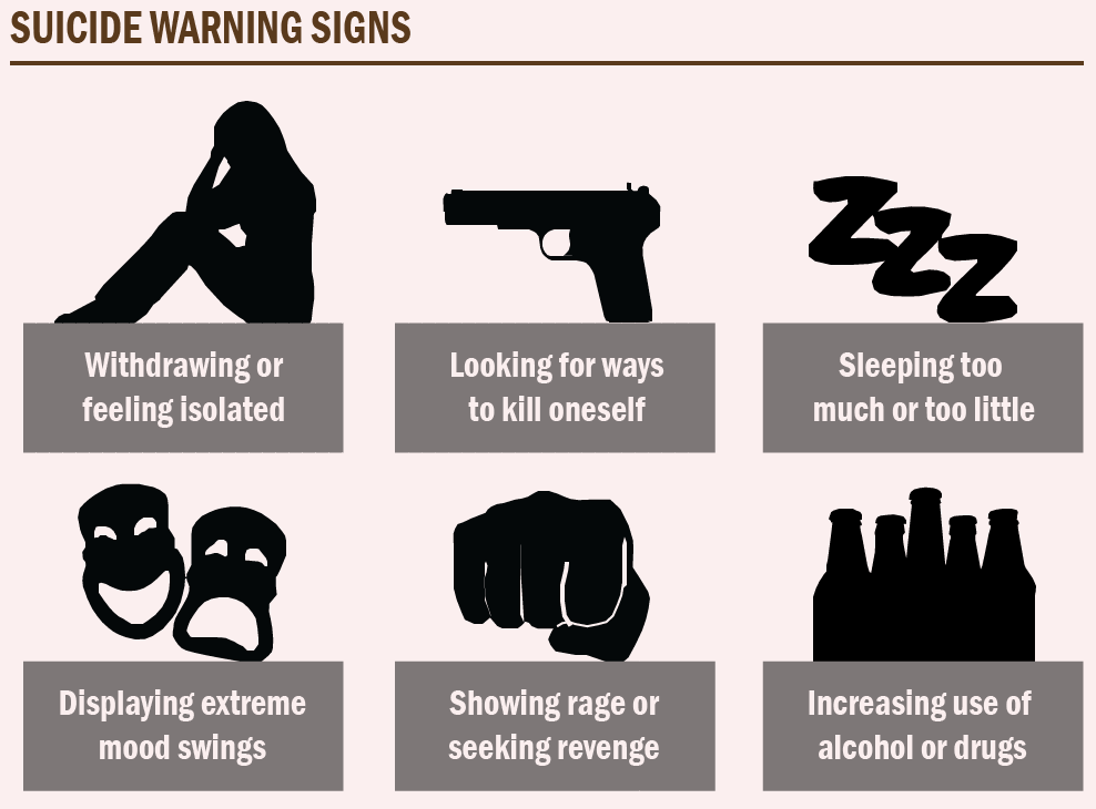
For the appearance display, we had to create an appearance element to communicate something visually. In my first iteration, I started out with realistic images but then moved onto creating silhouettes of the images instead. With my third and final iterations, I kept the same look & feel and adjusted the colors.
Location Display
For the location display, we had to come up with location-based concept related to our topic that we wanted to represent visually. There were only a few minor changes between my first iteration and my final display, such as the scale of the map and the placement and color of the overlay box.



Time Display
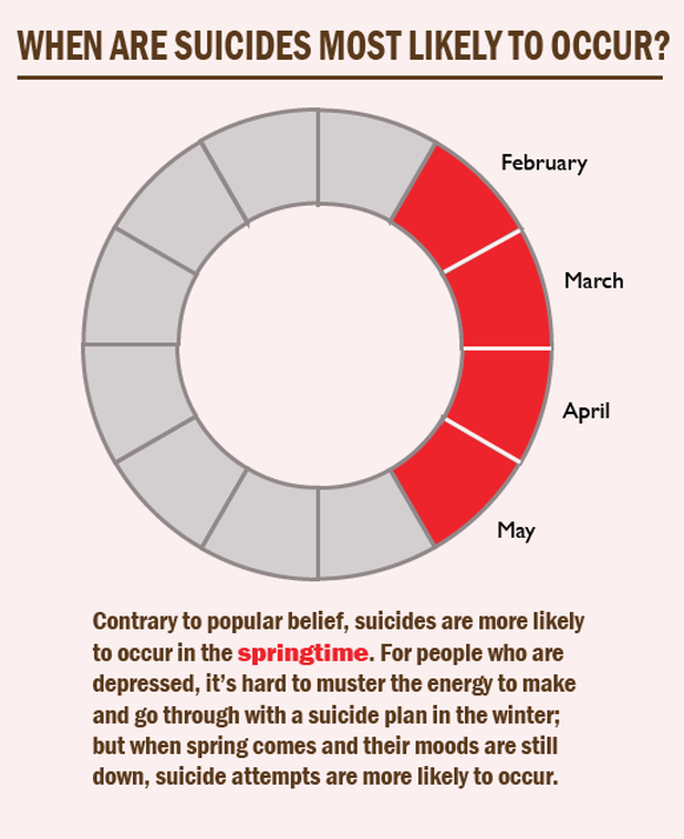
For the time display, we had to display a time-based concept visually. There’s a myth that suicides most commonly occur in the winter. However, in truth, suicides are more likely to occur in the springtime. Therefore I used my time display to visually represent the months that suicides are more likely to occur.
Relationship Display
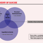
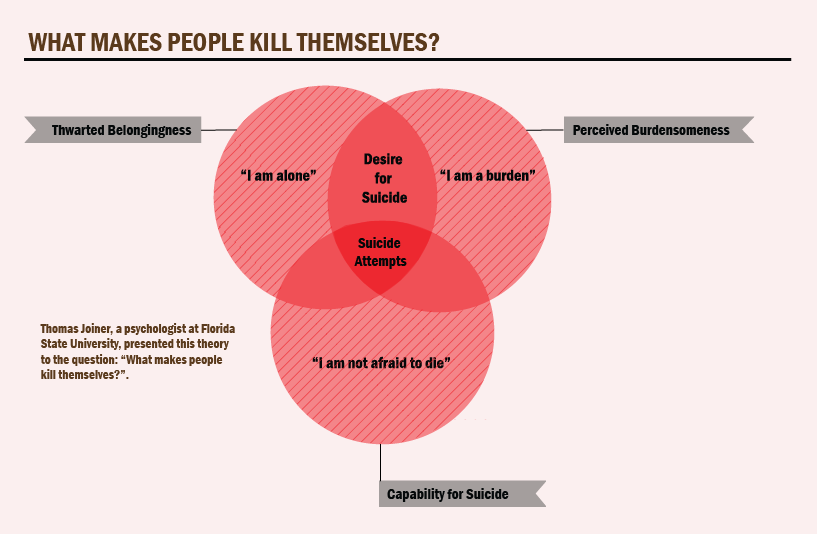
For the relationship display we had to select with a relationship-based concept related to our topic. I found a theory created my Thomas Joiner, a psychologist at the University of Florida. This theory uses venn diagrams to represent the answer to the question “What makes people kill themselves?” The theory is that there are three separate parts “Thwarted Belongness”, “Percieved Burdensomeness”, and “Capability for Suicide”. When “Thwarted Belongness” and “Percieved Burdensomeness” overlaps, people begin to have suicidal ideation, however, when all three parts overlap, that’s when suicide attempts usually occur.

Finished Product
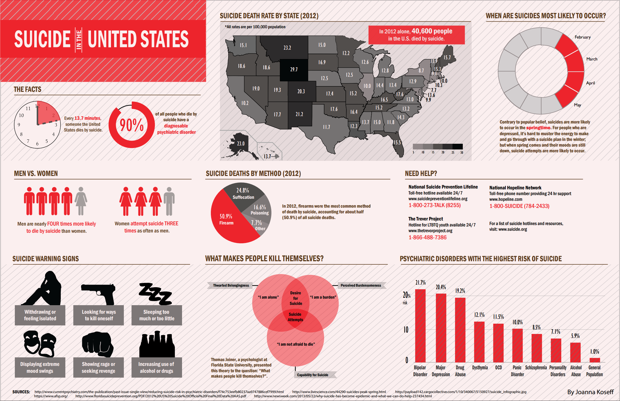
After iterating through each of my displays and recieving critique from my fellow classmates, I put together a final version of my infographic utilizing my base model for the layout.
